
Don’t make me name names. You know who you are. You are a hip new New York City restaurant, and you have paid someone big bucks to design a website that advertises your business.
Only your website doesn’t advertise anything. It may provide professional glossies of the dishes you purport to serve, or it may show a picture of the owner’s dog (one site actually does) or some other random image. But what it doesn’t provide is information. What you serve, how much you charge, your hours of operation — these are all dark secrets. So is your location.
Here as an example is a screen grab of one of the many constantly changing full-screen photos that make up the homepage of one new restaurant. The name has been deliberately redacted. (It appears beneath the black bar in the upper right.)
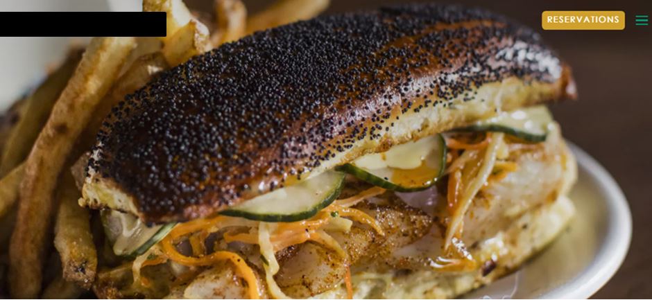
So what can we learn from this page? We learn that the restaurant serves a sandwich that may be a cheese steak, though there’s no language to bear out that hunch. We also learn that the house accepts reservations, which tells you precisely nothing since every restaurant on earth does that.
If you want more information, that’s for them to know and you to find out. If you scour the page for clues, eventually your gaze may light on the three green bars in the upper right corner. Clicking this releases a pop-out menu with all the vital statistics. Eureka!
But why not provide a constantly visible menu bar across the top that contains all these options? True, it wouldn’t be as avant-garde as the snapshot of your pooch. But it would make some of your potential customers so happy.


